The owner of Aegisfit, an activewear brand catering to both men and women, sought advice on how to improve their online store. Upon reviewing the site, I decided to focus on the landing page, as it’s the first interaction users have with the brand and plays a critical role in setting the tone for their shopping experience.
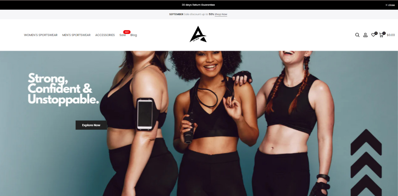
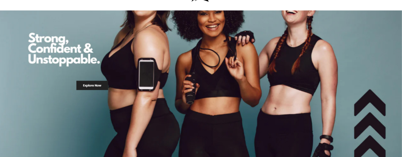
Before:

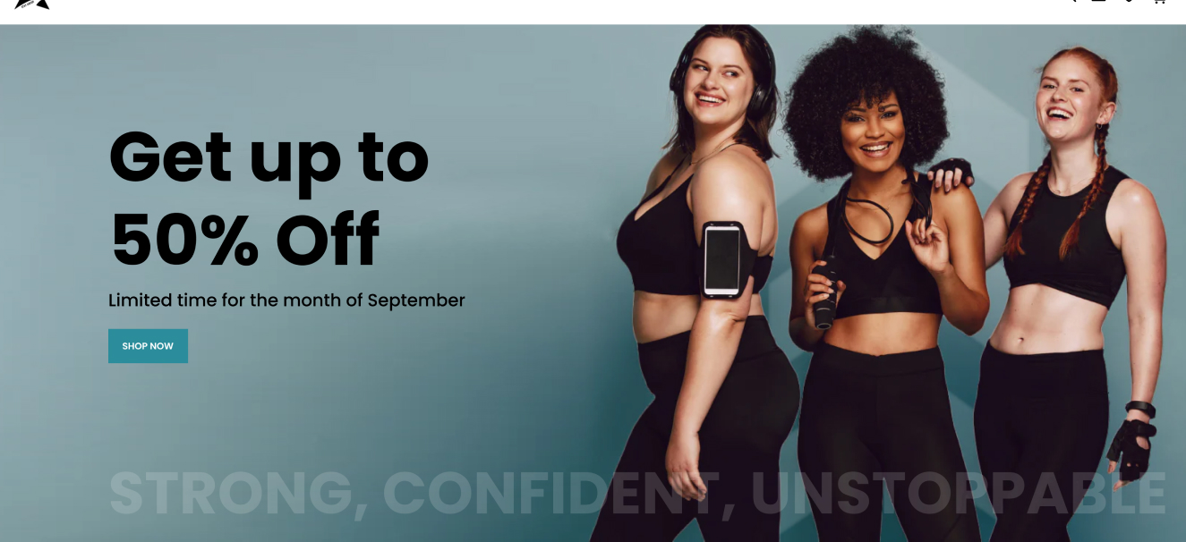
After:

Although the store owner already had a strong grasp on product categorization and user flow from "add to cart" to checkout, a few subtle but significant issues stood out on the landing page. These minor errors could potentially tarnish a first-time visitor’s impression of the brand, leading them to abandon the site without even exploring the products.
To address these concerns, I made quick but impactful updates in three key areas: the announcement bar, the hero banner, and the navigation. Here’s what I changed, and more importantly, why I made these changes.
The Issue:
Originally, the site had two active announcement bars. While this may seem like a way to present more information, it actually risks overwhelming users with too much content, leading to cognitive overload. As a result, visitors might miss both messages entirely.

What I Changed:
I removed the announcement bar that advertised a monthly sale and moved that promotional text to the hero banner (discussed below). This refocuses the user's attention on the most important information: the "30-Day Return Policy." However, I improved the messaging by changing it to “30-Day Satisfaction Guarantee,” which reframes the focus on customer satisfaction rather than returns. This subtle shift reassures users about their purchase, creating a more positive association with the brand.

The Issue:
The hero banner’s images were getting cut off on different screen sizes, making the design look unprofessional. On both my laptop and mobile phone, either the models' heads were cropped, or the text overlaid on the photo was illegible, diminishing the brand’s credibility.

What I Changed:
I removed the text and graphics from the hero image to enhance responsiveness across devices. Instead, I overlaid the background image with important promotional material, placing the original brand messaging at the bottom. This prioritizes conversion-oriented messaging—such as “Save up to 50%”—which is more likely to prompt users to start shopping. Additionally, keeping the promotional content outside the announcement bar makes it clearer and more prominent. It’s also worth noting that using text directly on images is usually ineffective. It complicates responsiveness, often leading to illegibility on different screen sizes, and it’s not indexed by web crawlers, which negatively impacts SEO and site ranking.

Making the call-to-action button more actionable and visible within the hero banner was another priority. The original button lacked prominence and didn’t encourage users to take immediate action. I redesigned it to stand out more by adjusting its size, color, and placement. By positioning the button in a more noticeable spot and using more compelling text like "Shop Now", I made it clear what action users should take next. This adjustment not only improves the visual hierarchy but also helps drive conversions by guiding users smoothly into the shopping experience.
The Issue:
Despite the intuitive structure of the site’s information architecture, the navigation bar appeared cluttered. It needed a cleaner, more cohesive layout to improve usability.

What I Changed:
I reorganized the three main element groups—logo, menu items, and icons—to create a more balanced and cohesive look. Centring the menu items streamlined the layout, while I moved secondary pages like the blog to the footer, keeping the focus on product categories. Additionally, I simplified the menu by removing the word "Activewear" after "Women’s" and "Men’s" since the brand’s identity as an activewear company is already clear.

Finally, I removed unnecessary clutter, such as the wishlist
counter, the sales menu badge (turning the link red instead), and
the cart total price. These adjustments create a cleaner, more
user-friendly navigation, making it easier for visitors to find
what they’re looking for from the start.
By making these simple but targeted changes to Aegisfit's Shopify store, we were able to significantly improve the user experience and overall professionalism of the site. Streamlining the announcement bar, enhancing the hero banner's responsiveness, and decluttering the navigation all work together to create a more cohesive and inviting first impression. These updates not only make the website easier to navigate but also enhance its ability to convert visitors into customers, setting the stage for Aegisfit’s ongoing success.The owner of Aegisfit, an activewear brand catering to both men and women, sought advice on how to improve their online store. Upon reviewing the site, I decided to focus on the landing page, as it’s the first interaction users have with the brand and plays a critical role in setting the tone for their shopping experience.
